|
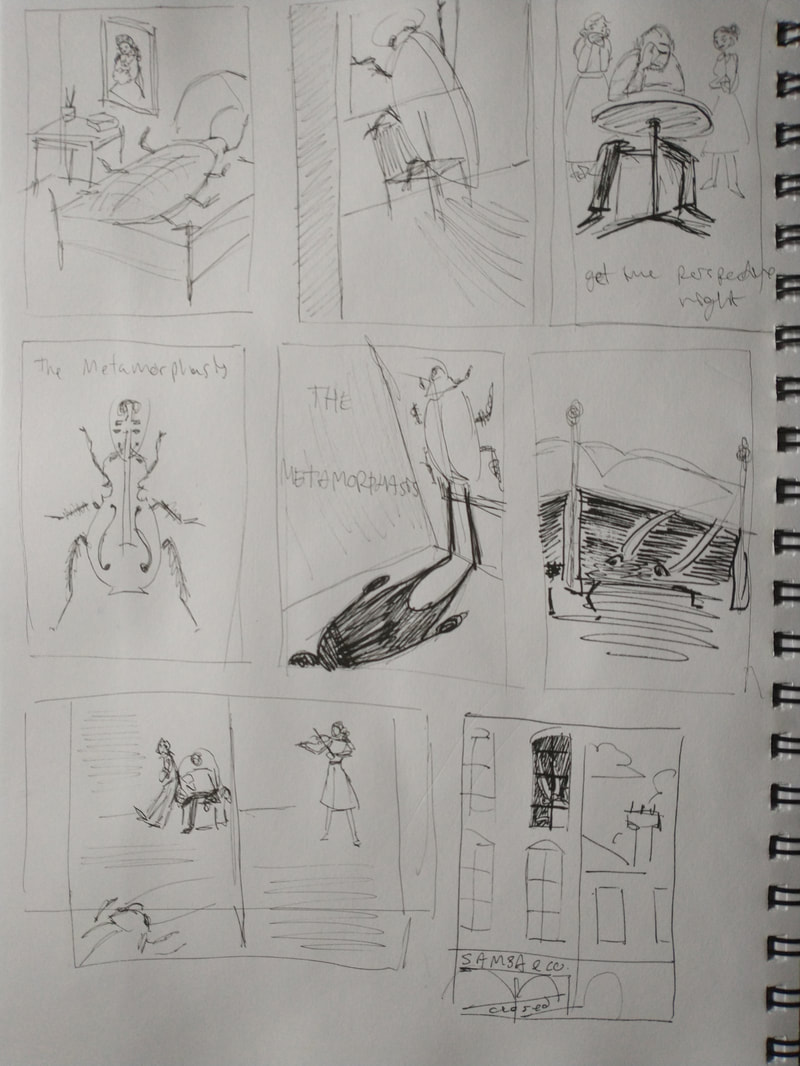
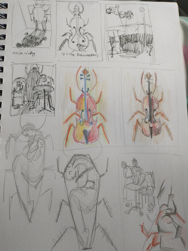
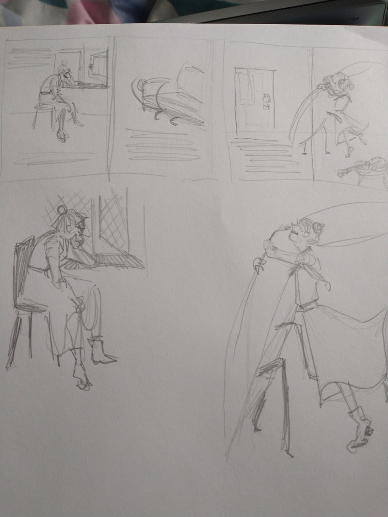
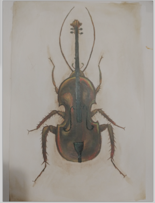
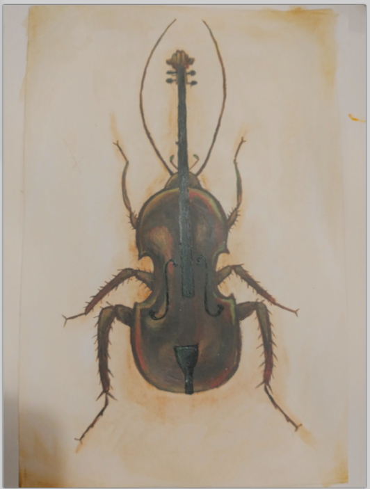
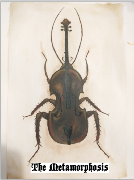
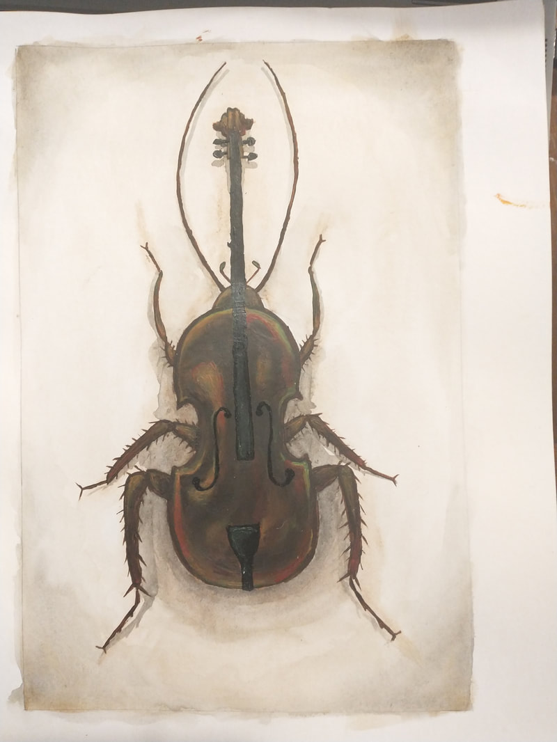
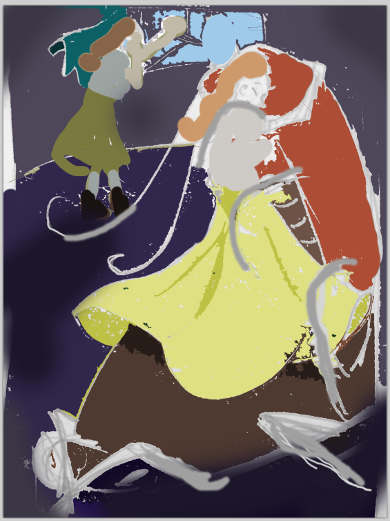
First week of thumbnails. I spent a bit of time looking at what others had done and specifically tried to think of ideas that weren't already done. No offence some of the artists but it felt like they read the first few paragraphs and left it at that. The Front Cover: The front cover design ended up being the first idea I came up with, even after thinking of others I preferred the violin metaphor over the others. The violin represents both the good and bad Gregor goes through, hearing his sister play and imagining her thanking him keeps him happy while getting too absorbed led to his downfall and eventual death. I edited the original image to check if it looked better with heavier shadows. I looked into various gothic fonts for the title, it needed to be unsettling but still legible as well as being the right kind of vintage. www.dafont.com/cretino.font?text=The+Metamorphosis&back=theme Single Page Interior: I settled on the scene where Gregor imagines being able to thank his sister while hiding under the bed as she enters his room. There's a lot of body language I could work with there and as I was struggling to pick a scene I decided to pick one that would play to my strengths the best. I used my computer to edit colour into the thumbnail and even though it looks terrible it was a good way to experiment quickly. I wanted the sisters skirt to be flowing around him as if protecting him, its his imagination that is keeping him somewhat happy despite his real sister being in the room and looking disgusted. All I'm able to provide are awful images of the final piece, Its very dark but you can see things better in person. I brightened the colours in the second image to fix the complaints that no one could see the cockroach on the floor. Double Page Monochrome: These are the passages that I ended up using as inspiration:
0 Comments
|
AuthorWrite something about yourself. No need to be fancy, just an overview. Archives
May 2021
Categories |


 RSS Feed