|
I started only wanting to protest loot box mechanics and its affect on children but after researching a little on how to protest I expanded my topic to be internet safety as I learned that protests are more affective if they have a bunch of issues under one banner.
https://www.vox.com/policy-and-politics/2017/1/31/14430584/protest-trump-strategies-experts Looking at examples of protest placards didn't get me anywhere. This issue isn't something that has a lot of angry hand made signs and is more something you need to nicely inform parents about. I researched ways to advertise things to parents rather than ways to rile people up. Marketing to parents: -the ones with young kids are millennials, they already understand technology -maybe target ad space on various social medias (what dimensions are their ads) -make something that they can talk to with other parents or gives advice or how to's. -relatable, encourage sharing experiences with others. https://sproutsocial.com/insights/marketing-to-parents/
0 Comments
I researched other examples of illustrations for the book. www.pinterest.co.uk/rainbowrachel80/metamorphosis/ I also looked into the art movements of the 1910's as the book was first published in 1915 Fauvism: French for wild beasts Expressionism: could be made unsettling enough to fit the vibe. Background is painted a colour before making the rest of the painting, usually some sort of red. I made a pintrest board of inspiration for this too. After looking into these art movements I realised the styles wouldn't really give me much to work with considering the source material. Surprisingly wholesome and funny. Thankfully gave me some ideas.
Gothic typography: The house is described as strawberry hill gothic (a mansion near London). The windows are arched with ogival hood, crockets and finials.  Various gothic interiors for inspiration  I looked into horror film camera techniques because I was struggling to think of camera angles for the exterior. www.slideshare.net/billiewilson_/camera-shots-and-angles-for-a-horror-and-thriller-film I was also inspired by Arthur Rackham's line art and muted colours for my full page illustration
My text was The Mind and Dying of Mr Punch, by David Grubb. The work needed to be violent and claustrophobic and I was also thinking about old fashioned fair ground entertainment, so my first inspiration was Pygmalion by Donald Rodney that I saw in Birmingham museum back in 2018. Its an interactive sculpture of Michael Jackson in the style of coin operated laughing policemen found in old fairgrounds. Unfortunately, the real meaning of the piece is exploring the racial identity and masculinity but all I remember about it is being jumpscared in a small dark room.  I also used a little bronze figure of punch that my grandparents own as a reference for sculpting my own punch. I didn't go and visit them, they sent me the photo.  I used Raymond Briggs as an inspiration for most of these. I've admired the emotion he can put into his artwork for years. This one image from Ethel and Ernest is enough to bring me to tears. I have always wanted to try a similar style, and try and put as much emotion into a piece, so this topic was the perfect opportunity to finally try. The focus on the hands gripping the counter is what holds the most emotion for me so I tried that in the good news prompt.  The anniversary was inspired by the same advert that tango was, as I wanted it to be a sequel. I wanted genius at work have the vibes of an old oil painting, which was a mistake because I didn't have the patience to do all that shading.
Ambush There aren't many dynamic camera angles or moving shots in old films. However, the big trench coats they all wear in film noirs can provide a lot of movement and the lighting techniques used, such as A lot of film noirs were directly adapted from stories printed in magazines that often had accompanying illustrations.
The vibe of Tango made me think of the new Stella Artois advert. It involves people dancing in a pub and the warm lighting makes it feel very cosy, although I think the style could work for something more intimate. The advert was created by Stephan McNally, https://blinkink.co.uk/directors/stephen-mcnally Giant leap involved people doing parkour in a city setting, so I was inspired by spiderverse. It has a wonderfully unique animation style and captures the movement of the characters and the comic book aesthetic perfectly.
Ellen Jewett makes these amazing ceramic sculptures which I took inspiration from, except I used paper mache instead of ceramic as I didn't have the materials.
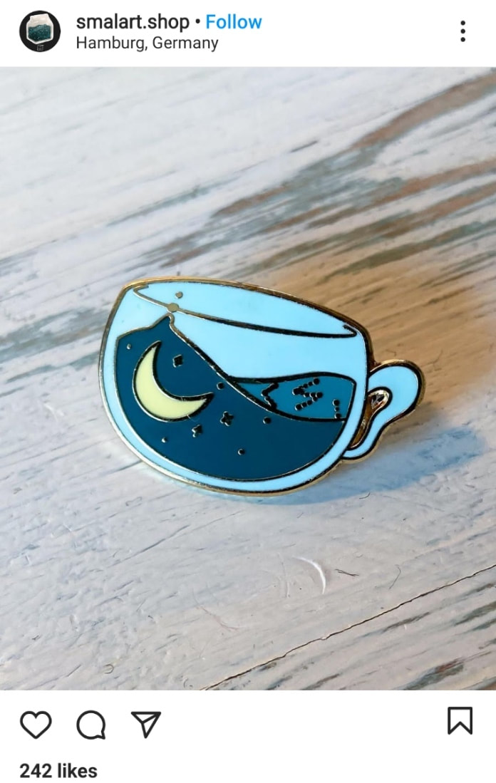
ink-the-artist.tumblr.com/post/616066263660347393/ohhhh-how-is-all-of-your-art-so-beautiful-i This is a Tumblr post for a tutorial for this cute little felted dog. I didn't follow the whole tutorial but it did inspired me to felt my final mask. It also inspired the little poodle I made with paper mache, but I used bubble wrap as fluff because I didn't have felting equipment in Carlisle when I made it.  My inspiration for my food mask was this horrific task in the champion of champions episode of Taskmaster.  Enamel pin badges are usually between 15mm and 45mm with at least 0.2mm separating each colour. The backing card is usually around 50mm by 80mm. The metal part of the badge can be plated with various other metals to get the desired effect. There are two types of enamel pins, hard and soft. Soft enamel pins are cheaper to produce and are capable of having brighter colours but are less durable. You can still feel the raised details of the metal walls of pin. Hard enamel pins are more expensive and durable but cant have as vibrant colours. They have enough layers of paint so the surface is completely flat. Colours can be picked using Pantone, a colour matching service used for product design and manufacturing. Below are some badges I found on Instagram that I liked the look of, especially the ones with the backing cards included.
Animal Crossing already has a simple art style and lots of lovable characters that don't have a lot of colours in their designs, so there are a lot of things I could've chosen. The game also has a lot of dialogue, and many good quotes. Lucinda Rogers' style was an inspiration while adding to my sketchbook, more the urban sketching than wild life drawing. Its loose and quick looking while still capturing the personality of the place. I also like the sense of depth created by the thicker fore-ground lines that get thinner the furthers something is.
The detail in old industrial buildings, abandoned or not, has always intrigued me and I really should take that inspiration and run with it more often. www.instagram.com/jemma_gunning_printmaker/ Lots of heavy shadows. Gives me another reason to want to go urban exploring. Some youtube channels I've found with very relaxing painting tutorials. www.youtube.com/channel/UCHupLsLZF7tlrBLRKPWqXrw I didn't even need to think before choosing Leyendecker as an inspiration for this task because I think his style is quite cute. Wasn't expecting it to be so hard to emulate. I found this video that went a bit more in depth on techniques he used,
www.youtube.com/watch?v=yyxuhe8v30s&list=PL1HIh25sbqZlj21Ar-96phLN0UklfDOr1&index=12 , so I tried thinning down the paint when trying his shading technique of thick brushstrokes and it worked a lot better. I also learned from the video that his paintings were typically rather small, which is great news for me because I hate doing large paintings. |