|
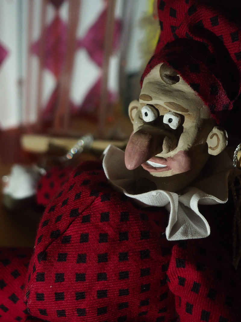
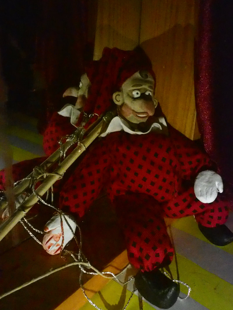
Lets start with the thumbnails for my Punch illustration:  Here's some of my favourite shots from the photoshoot, before I added any photoshop or drawing over the top. I wanted to add a hand drawn element to these photos to enhance the feeling of what is real. Punch being a physical creation but the hand controlling him being fake is the opposite of how it should be. I hope the effect works.  
0 Comments
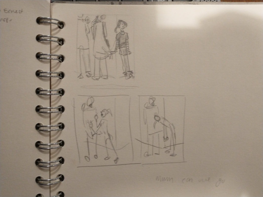
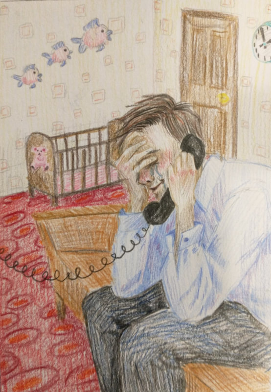
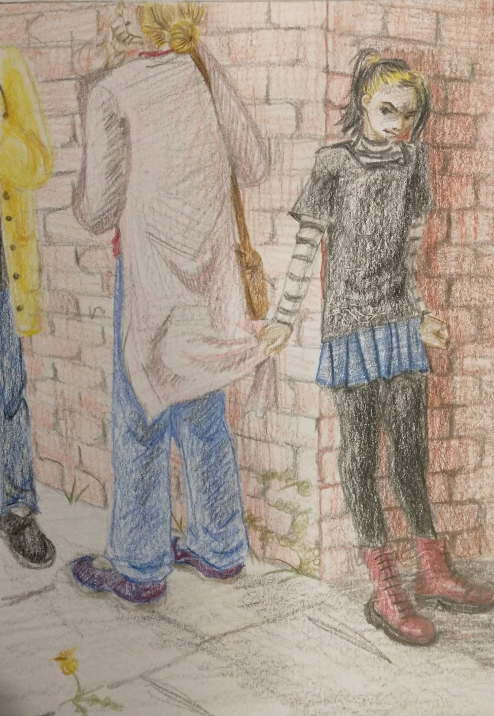
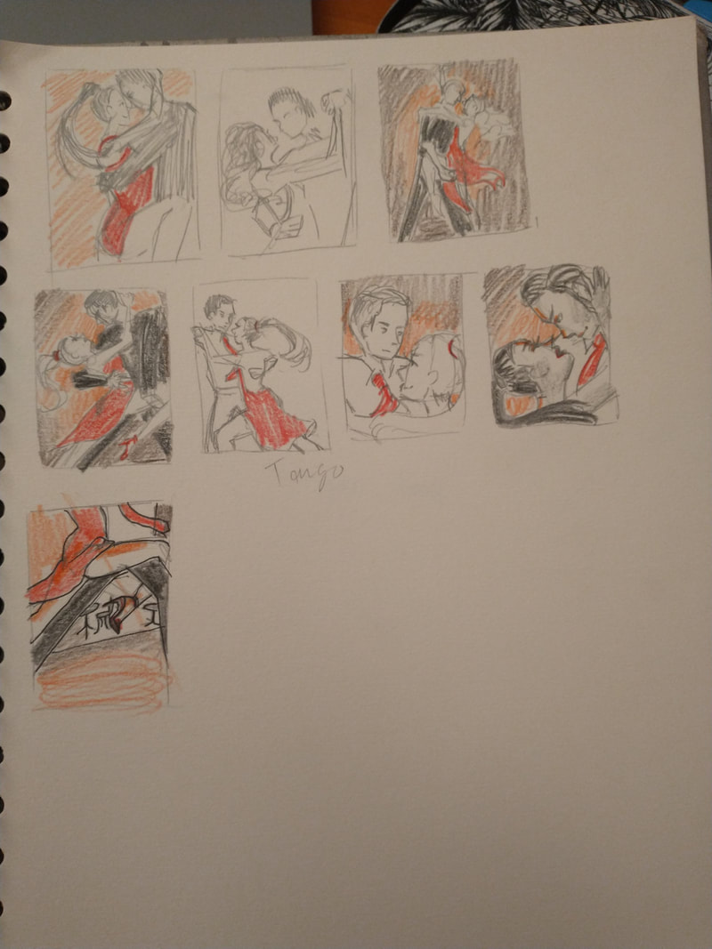
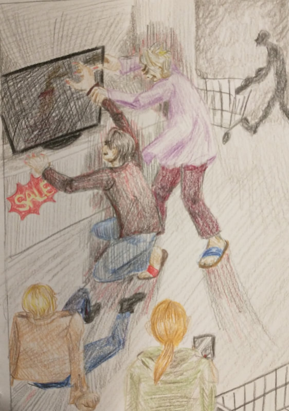
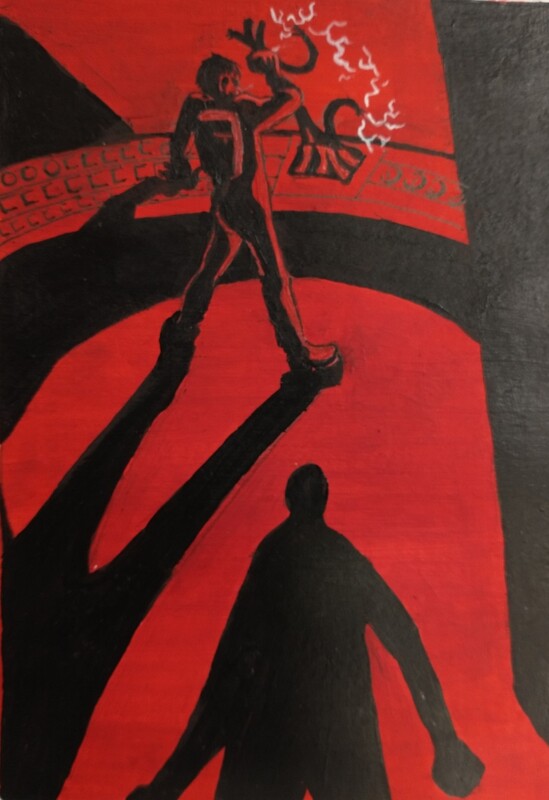
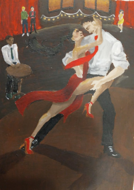
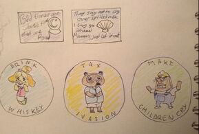
Angry boss was me trying a bit of caricatured body language. I made sure he has tiny business man hands. Good news was inspired by Raymond Briggs but instead of a man breaking down over something tragic, he's crying in relief. I think I managed to portray it quite well. Using my dad as a reference photo made the figure look too much like him. Mum can we go. I have a lot of experience with this emotion but I never wanted to make a big scene by dragging mum away, so she's only gently pulling on the cardigan while being frustrated. The anniversary has the same couple as the tango prompt. I like the candle smoke and the positions of the figures but I think I made them too small. Big jump. I think I squished the figure into the side too much and lost the effect I was going for, he isn't far enough down in the corner so he doesn't look as scared or trapped as he could. Genius at work. I am pleased with the colours and composition of this piece. However, like with the anniversary, the figure isn't big enough to covey the body language well enough. January sales started by focusing on the claustrophobia but didn't feel frantic enough, then when I focused on the rush I lost the claustrophobia. Systems failure definitely wasn't inspired by Among Us, having someone sabotaging the spaceship, but looking into the other side was also fun. Vertigo had some really fun perspective potential and I had fun playing with it. The angel idea came about only because I liked the curved church spire too much and needed a figure. Tango was a struggle only because I've never drawn stuff like this before. The dark, warm background never changed because that feels most romantic. Ambush started out pretty generic with a street mugging. The black and white film aesthetic is interesting as well as old films having different shot composition. The black and white also gives me an excuse to play with real dramatic lighting that hopefully enhances the movement. Giant leap was inspired by spiderverse so I think it was a mistake to colour the background with marker pens, the colours aren't bright enough. Apart from that I think this one is my most successful attempt at movement, the poses are very dynamic. I had many of the same problems with this as with photoshop, still entirely due to my computer and general inexperience. This time I used inkscape as an illustrator stand in. My first idea was to make pins with quotes on as they are a fairly popular design and animal crossing has a lot of quote worthy dialogue. I then tried a funnier approach as its a common joke to add grown up themes to such a wholesome game. Not too adult though, that's just gross. Now I've made one I think this idea is cringy.
A previous pin on an improved background.
I have very little experience with digital art and even less positive experiences. It didn't help that my computer is so old it cant run photoshop but I used paint.net instead. This whole task was useful for getting me out of my comfort zone and finally looking into how to use this stuff, but I cant say I've been sold on digital art.
I am almost happy with this poster. I think it definitely has potential but I'm struggling with my photoshop stand-in and don't quite know what to do to it.
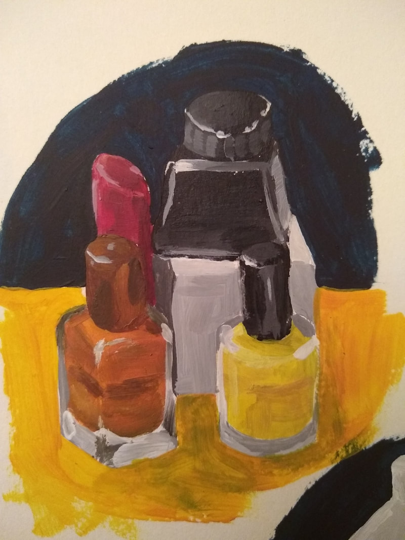
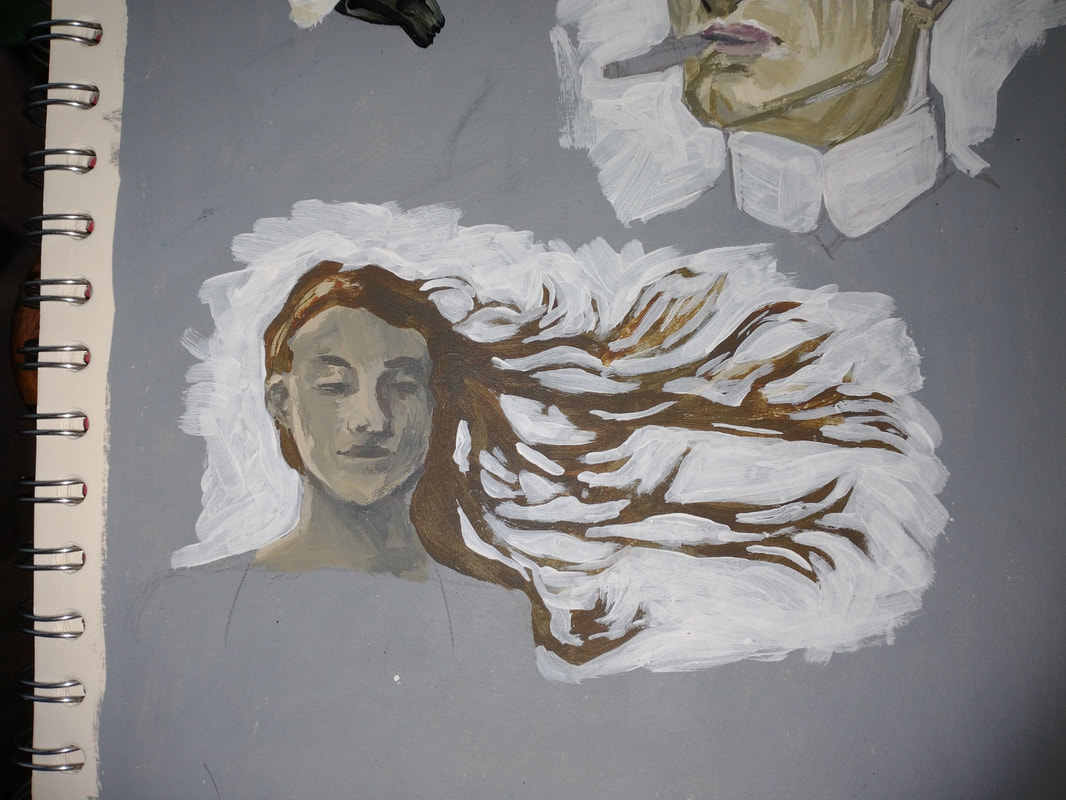
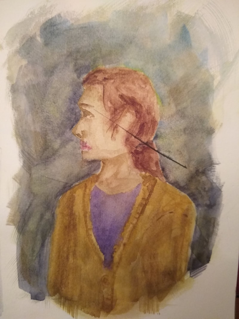
The view of my living room. Its comfy but not as familiar as my Bolton home, which I tried to get across with my use of flat black areas and using less local tone than I usually would on the sofa and walls. I may have over worked the watered down ink. The different thicknesses of line-art were inspired by Lucinda Rogers and the flat black and texture were inspired by W. Heath Robinson.  I had no idea how to answer when I was asked if I was a drawer or a painter in Tuesday mornings lecture. After two days I think I've decided I prefer painting. A still life in the style of Ewan McClure and a self portrait in the style of J.C. Leyendecker. I find acrylic paint easier to control and more forgiving if I make a mistake. Being able to layer lighter colours on top of darker colours is something I took for granted until I started on the watercolour half of the task. Having to mix colours is another downside to acrylics, it takes a while and its hard to replicate a colour I've previously mixed. I definitely prefer acrylic to watercolour but they do both have their own charms. Definitely didn't put it off until I'd had my fun with acrylics. Its much easier to blend colours with watercolours, its also easier to mix colours Alan Lee:
The other watercolour artist I was inspired by was Ambrose Mcevoy. I found the loose brush strokes for the background were fun to copy and I ended up enjoying experimenting with his style. I started off coping some of his existing work before moving on to my own. This brief almost made me homesick; I have so much junk i could use back home..  My 50 minute mask, a horrible concoction of coffee grounds, BBQ and hot sauce spread over a wrap. Inspired by an episode of taskmaster. A cat made of old fur and cardboard and another made of old receipts. A poodle made of bubblewrap.  My amazing final mask, made from cardboard shoe forms from my black Friday impulse buy and wool used as biodegradable packing for mums Christmas cheese package that I felted into this weird goggle shape.
Took me a while to get back into the swing of things. Dip pen practice of the house across the street and a self portrait.
|