|

|
|
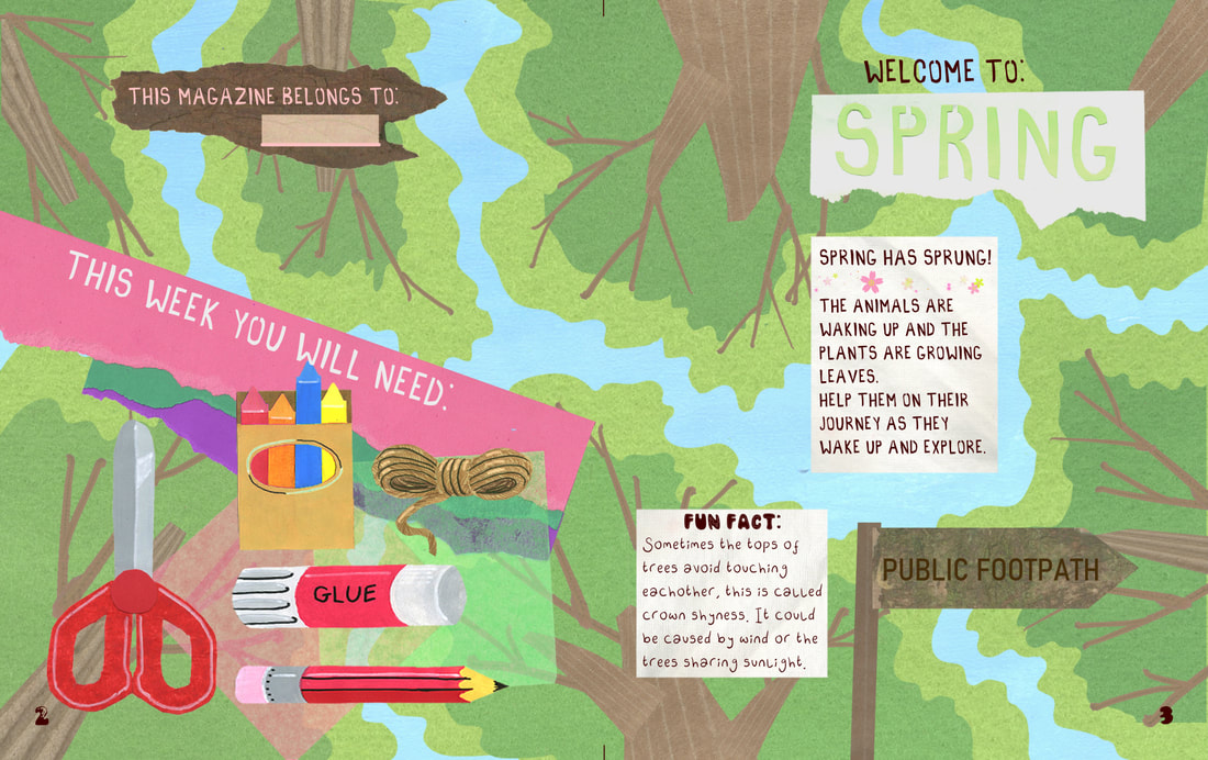
Pages:The development of the introduction page of the spring magazine.
The dynamic view of the trees is much more clear and interesting than the vague candyfloss tree. |
|


|
The maze background was pink instead of yellow for a while but that looked like worms instead of branches.
|
|


|
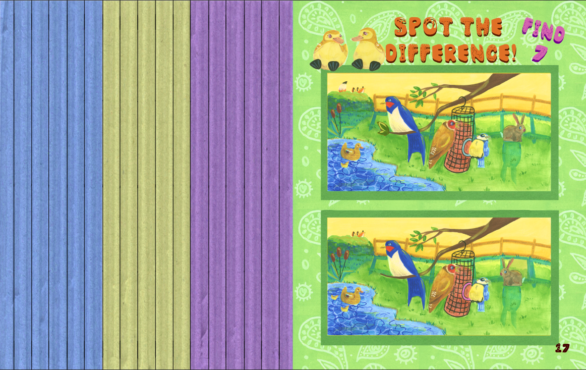
The spot the difference made me notice how bad my digital drawing attempts were.
Its too dark and flat and the line art is too thick. Entirely not the vibe I was going for. The new version is much more appealing as a kids illustration. |
|


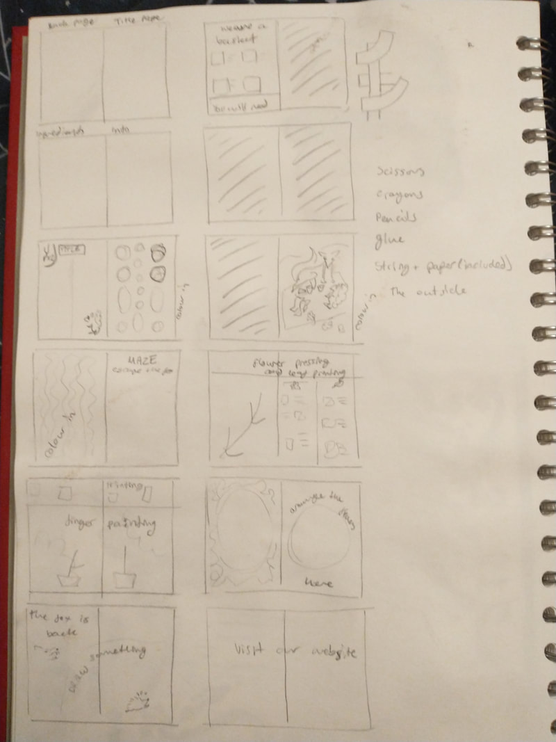
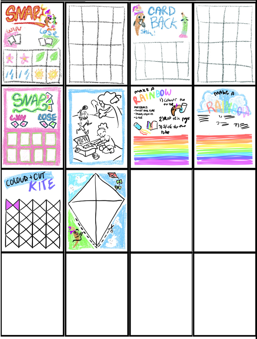
The plan of the inside of the magazines. I originally planned to only have 16 pages, but realised that would be too small to provide any enjoyment so I upped it to 24.


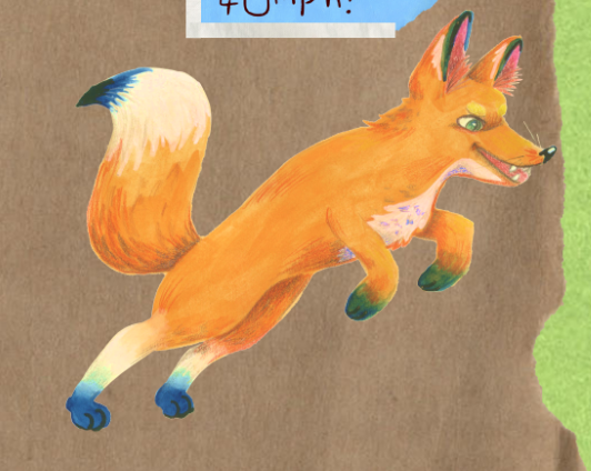
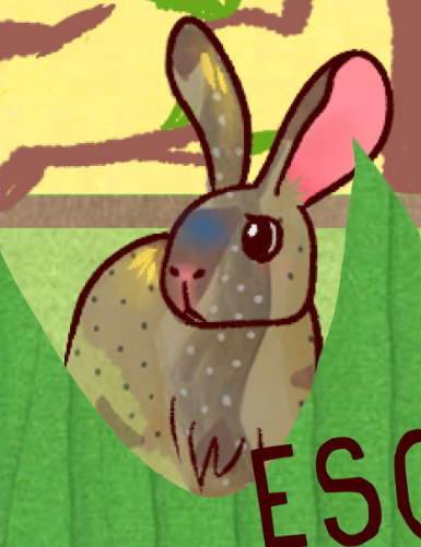
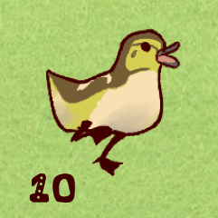
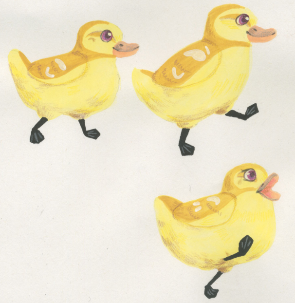
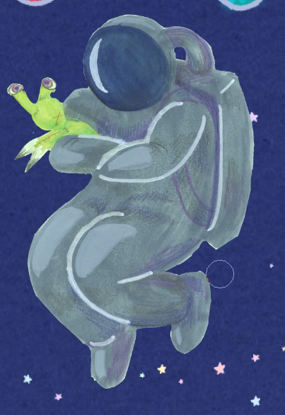
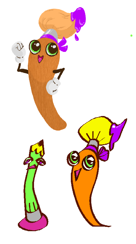
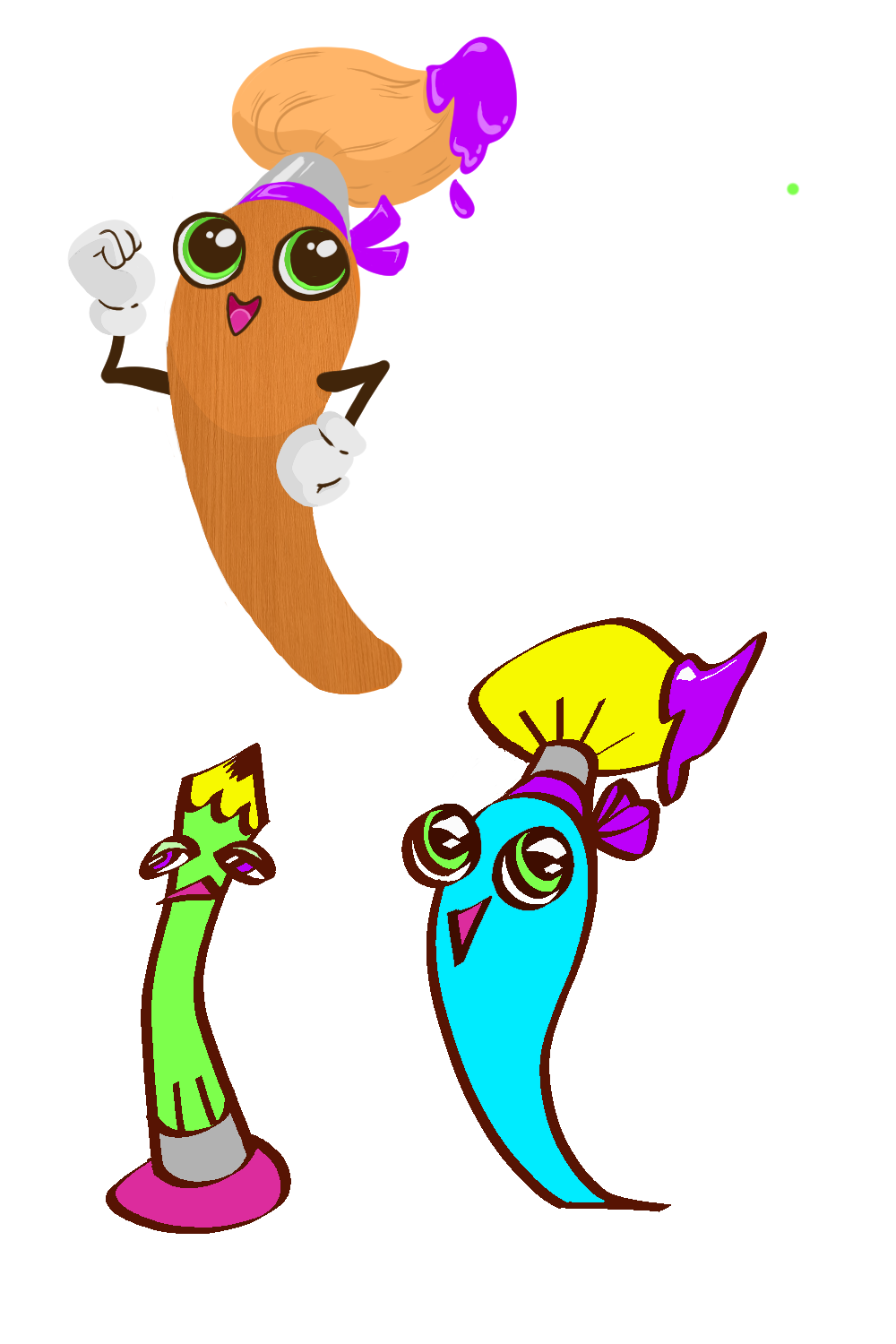
Characters:Despite liking the patterns I added to some of my drawings, I hated they way they looked so digital. It didn't fit the collage look I wanted.
I redrew all the characters with gouache and coloured pencils and scanned them in, giving all the illustrations more texture. The main change I made while redrawing them was the eyes. By making them larger I could add more personality and emotion to them, which would then resonate more with young children. (I still hope I got enough emotion through with just body language for the spaceperson.) |
|


Mascot:
|
I planned to have a mascot that would be included in all issues of the magazine and would talk the kids through the tasks. I wanted something cute, like Hello Kitty, and would change outfits to fit the theme, like Mr. Benn.
I eventually decided to abandon the idea and have a different cast of characters walk the kids through each issue of the magazine. |
|

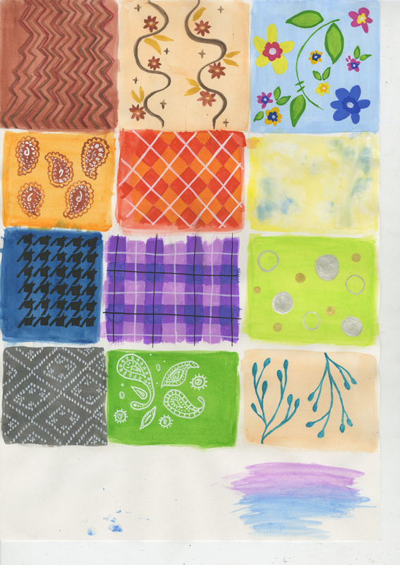
Patterns and other:
|
After drawing the first lot of animals, I wanted to add to them in a Lauren Child/ Charlie and Lola style. I drew a variety of patterns to patch together to make the animals but ended up mostly using them for backgrounds.
|
|

|
I made other physical things and scanned them in to aid the collage/cut out aesthetic I was going for. The felt and fabric were most useful for backgrounds and were easily edited to be any colour I needed.
The finger and hand prints as well as the brush strokes and general mess were used to decorate empty spots on pages. I think the cutout, hand drawn materials gave the 'you will need' pages a much more interesting look than just drawing them. |
|


Fonts:
|
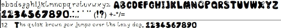
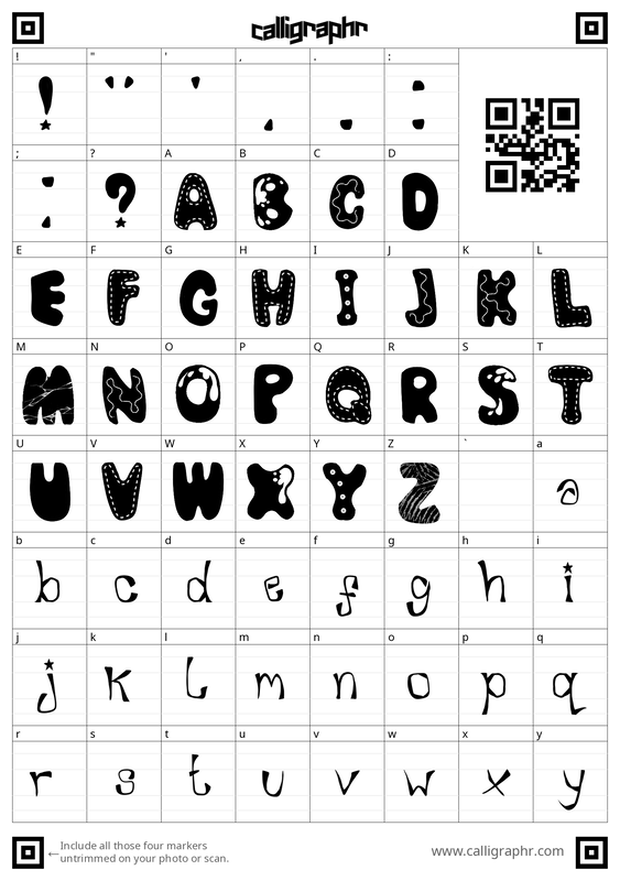
I made 4 fonts for this project that I used throughout most of the two magazines.
These are the final fonts along with the paper cutouts I made two of them from. |
|