|
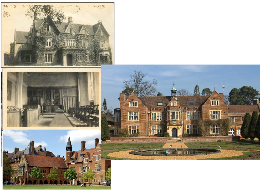
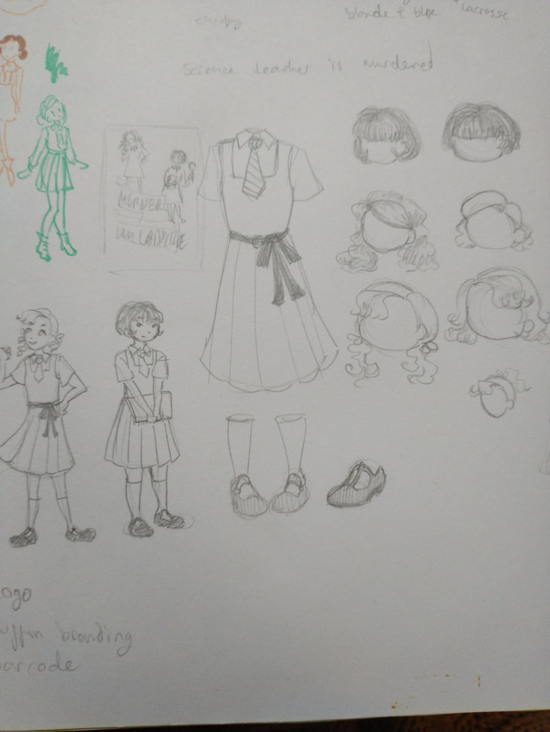
A Murder Most Unladylike: A book set in a 1934 all girls boarding school staring two main characters. Daisy, the popular, bossy stereotypical English girl and Hazel, an immigrant from Hong Kong who is the main character. They discover the body of the science teacher in the gym but they are the only ones who know. School uniforms in the 30's were a shirt and knee length pinafore with a pleated skirt. They would also sometimes include a necktie or a sash around the waist. Hair styles were short, no one in any images I saw having hair past their shoulders. The map of the school in the front of the book showed its a pretty small school, it also doesn't make sense. When I think boarding school I either think of a Hogwarts castle or an old stately home in the countryside with ivy growing up the wall. 1930's architecture was the beginning of modern looking buildings, with curved walls and smooth white exteriors so my boarding school design will be a building that's been standing a while. Reasons boarding school stories are so appealing: These types of stories are so popular due to the sense of escapism they provide. It gets the control of parents out of the way nicely, giving the characters more freedom. Going to a fictional boarding school is so appealing because it lets kids imagine a place where they have fun lessons in an old fancy building, with a close group of friends and comically inept bullies that get bested by the end. Using bright, warm colours would help with the feeling of escapism, making the setting feel inviting. Including hints to the darker themes of the book on the cover would contrast with the colour choice and if I make it noticeable enough it wont shock kids too much when they read the book and find the darker content. I looked into children's books and school textbooks for inspiration. In the modern day, they all look a bit brown but I assume they were much brighter back when they were new. Usually a single colour background with a relatively simple illustration printed with black and white, with the background serving as the only colour. Children on these covers are adorably squishy looking.
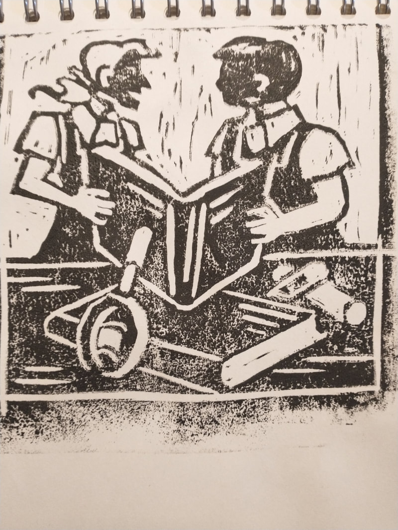
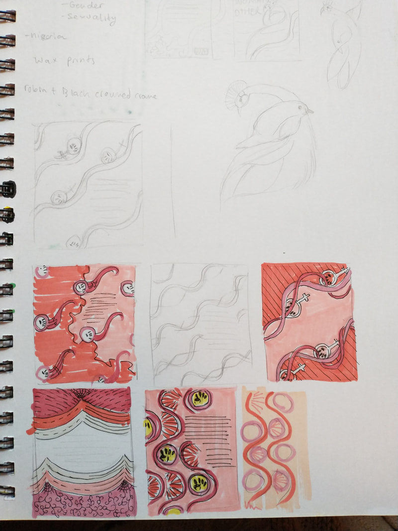
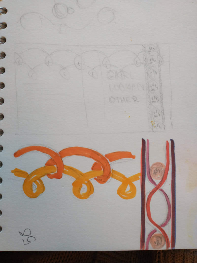
 Overall, I'm quite proud of this one. It was entirely my comfort zone. My first attempt was done in acrylic and I hated every minute of it. I also didn't check the template with the logo and barcode on, assuming I could change their positions. I had a lot more fun once I paid attention to the template and went back to my watercolour comfort zone. I also ended up being proud of the title type, and that I managed to photoshop that shadow in, even if it did make me cry. ___________________________ After sitting on it a while I decided I actually hated the cover. I borrowed a book from a friend about the history of penguin books and decided to go back to my original idea of a simple, vintage cover. The final book cover with the faces edited to match the rest of the skin. I didn't have the tools small enough to do it on the actual lino print.  Girl, Woman, Other: Multiple interconnected stories featuring most black women and the successes and struggles they deal with.  qwPaintings: Abstract, geometric. Typography: I didn't want to use anything that came up when I searched 'African fonts' as they were all stereotypically 'tribal'. It needs something bold and modern. I found a font made by an African man specifically to bring attention to colonialism, called colonial bastard Rhodes. I thought it would be a fitting choice for the book. However, I couldn't find a place to download or buy it so I used something similar instead. mamgobozidesign.com/colonial-bastard-rhodes-typeface Fashion: Wax prints Hair wraps Colour pallet: Warm browns Orange Various other warm colours Bright blues Specifically for this book Textures: Cloth (for the wax prints) Wax prints: A very iconic and popular African look with each design having symbolic meanings. https://yevuclothing.com/blogs/stories/the-hidden-meanings-behind-africas-wax-prints https://www.vogue.co.uk/gallery/eight-stories-behind-traditional-african-wax-prints For my design, I used many interconnecting lines to show both the different characters in the story and the various cultures of the characters. The colour scheme is based on the lesbian flag, and included the feminist fist as well. I looked into how to make a wax print but I didn't have nearly enough materials. So I dyed some fabric pink and painted my design on with watered down acrylic paint.  I struggled designing this one as I got stuck with how broad of a topic it seemed to be. Not only are there 12 completely different main characters, but they have an entire continent of culture I know nothing about. The story itself also tells a very important story that I was scared of not representing properly. I eventually decided on my first idea, the wax prints, as I ran out of time to find anything else.
0 Comments
Leave a Reply. |
AuthorWrite something about yourself. No need to be fancy, just an overview. Archives
January 2022
Categories |


 RSS Feed